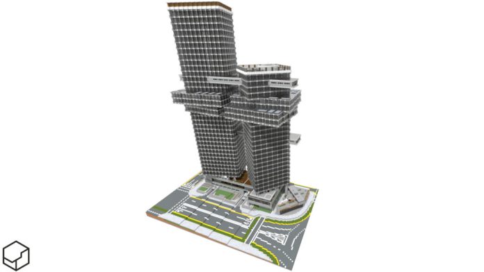
I’m currently in a skyscraper mood, as proven by these recent projects. Who am I kidding, I’m always in the mood for a good skyscraper. Outside of some 1-2 random side projects, which we don’t talk about. I could make a video on this, and I still might, but I feel most comfortable typing.
Important, fun notes:
- No texture packs or mods are used in the pictured builds
- All mentioned projects have free downloads available 🙂
Skyscrapers: Macquarie Financial Center
This skyscraper complex was built for the Cubed Creative contest, which has been extended 2 weeks and is open to entries! Cubed Community & Cubed Textures – Minecraft Resource Pack (modrinth.com)
I entered the contest on a whim 2 days before deadline, and was barely scraping by to make it on time. Turns out, not many people entered so the contest was extended a full 2 weeks. Nevertheless, I intended to finish by the old deadline (which is 3 days total including the deadline day), and I did it!
On texture-packs:
Realism texture packs are not necessary to make realism. The projects in this post are examples. BUT it’s much harder to get the smooth textures and tones of the city in vanilla (and there are no detailed models if you’re into that). Using a texture pack can make your life easier. HOW I see it – depending on the type of your build, using textures limits the availability of your build, as someone has to use your specific pack.
Cubed-texture-specific help pages (outdated):
This contest requires the Cubed texture pack, which is so complex that it is only available on 1.14.4. After that version, Minecraft’s biome mechanics change, preventing the pack’s 100+ precise biome-dependent models from working. This means that YES – I then proceeded to export, copy and convert my build into vanilla for sharing and rendering. I knew the build inside and out, so I was the one to do it well, quickly.
The basic requirement was modern twin towers. My idea was to keep to my unique style, without going crazy with things like curves, and see how I can overlap the cube shapes to make an interesting design. A diagonal works perfectly & allows the towers to be offset from each other for waterfront views.
I hate building multiple skyscrapers in the same complex and having them disconnected. This can be seen throughout my previously completed Skyscraper Week… Initially, I thought skybridges weren’t allowed, so I created the two “slices” of floors sticking out the middle, that overlap the towers, but don’t cross over. It turns out skybridges were fine, which solved the issue of “How do I make the towers not empty/boring.”
More realism: I considered structural stability. My towers aren’t floating – if you look on the cover image, there are some white/iron blocks separating them from the base. It was meant to be a filler that’s also a mechanical floor (don’t question my genius). I referenced the gravity-defying CCTV HQ in China to judge whether my cantilevers were over the top. I decided they weren’t, but that the bottoms of the towers MUST BE very grounded with columns and walls to hold up all the other craziness going on higher up.
While I didn’t use ANY inspiration images for this tower (maybe that’s why I kept such simple general shapes, which isn’t bad for a realistic financial center), I probably subconsciously references One Za’abeel:

Full design brief:
max y=230 for WEST TOWER, max y= 180 for EAST TOWER
Context: Financial complex consisting of 2 towers (east and west tower) connected by a base, managed by major Australian financial company Macquarie Group. This complex is located in the financial district of the city, right next to the waterfront area. The complex should have office and retail space.
Style: 21st century modernism / new millennium / biophilic
- 2 towers have to be positioned slightly offset from each other, – – considering views of the waterfront.
- Logo of Macquarie Group must be displayed on both towers and the base (logo shown in the video).
- Name of the complex must be displayed somewhere.
- Towers must include structural pillars and may have setbacks (avoid generic box shapes).
- Base should consist of lobbies for both towers and retail, & sheltered walkways along first floor exterior.
- Entrance to underground parking (actual carpark not required)
- Car drop off point in the centre of the plot, from southern road.
- Small plaza with greenery on the east side (consider access points)
- Pedestrian passage from north to south through the complex without going into the buildings.
CC Macquarie Financial Center [Pack 1.14 / Vanilla 1.14+!] Minecraft Map (planetminecraft.com)
Small offices: Monstera Medical Center

I babbled on about that skyscraper, so I’ll keep it short here. This building has the exact same context as the skyscraper: Done for a Cubed contest, later copied out and changed to vanilla texture compatibility.
Except this one is quite BAD in contrast. There wasn’t much thought put into this build, so there’s not much to say. It just works. BUT I know I could have done so much more with the design. Or maybe I couldn’t, because I wasn’t as good of a builder 12 months ago. I used surprisingly few features of the Cubed pack in this build, and created a basic shape of 3 flat boxes. Some of the layout makes no sense, there are narrow hallways, and I don’t think I met the design brief. But I like the cars!
CC Monstera Medical Center [Pack 1.14 OR Vanilla 1.14+!] Minecraft Map (planetminecraft.com)
All in all, true realism building forces you to consider the implications of real constructions like the structural integrity, building purpose, interior layout, materials… Are we taking it too seriously? Maybe. Why not, if it’s fun! Just ask licensed architects like Minecraft builders Alpine1 or Ryermeke.
Other projects:
Oh hey, it’s a leap day. Happy February 29th!

